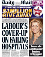
What was the task you were given and who were your target audience?
- We were assigned the task of creating our very own front cover page for The Daily Mail, every aspect of the newspaper had to be created by ourselves, the only parts which we could copy and paste were the Masthead and the photographs that relate to our chosen stories. Before we were sent away to complete the task we were given a list of news stories and adverts which we could choose from, by doing this it eliminates everyone creating similar front covers. When considering which stories and adverts to choose from I thought carefully about the technical conventions of a mid market tabloid so that my front cover had representations of this specific genre of newspaper, i.e. hard/soft news, larger text and adverts. The target audience for the Daily Mail tend to have a demographic profile of ABC1 therefore, I had to take my lexis and mode off address into consideration in order to live up to their expectations.
What research did you undertake to complete this task?
- Before designing anything I took to Google so that I could analyse some of the traditional Daily Mail newspapers, I scanned through a few so that I gathered ideas on their layout and the way that they address their audience through their stories, photographs and text. I made sure at all times that I had a legitimate cover page available so that I was constantly referring back to the original source, this ensured that I wasn't creating something that didn't appear to look like the newspaper genre.
Which Daily Mail front cover did you use as your main source?
Which areas did you find most challenging?
- I found that creating the headlines and the text was the most challenging aspect of the task, it was extremely difficult to mirror the exact font, so in the end I had to design every letter individually and then I stretched them and pushed them close together. Once I had completed this action for each letter I then print screened the page and inserted it as a picture onto the front cover. This was very time consuming however, it is virtually impossible to mirror the exact font unless you print screened from the legitimate newspapers - which wasn't part of the task!
How successful do you think your front cover page was? What could be improved?
- Overall I am pleased with how my front cover looks, I feel it does have some similarities of a traditional Mid Market Tabloid for example, i am pleased with how my advertisement looks above the Masthead. To improve i need to consider the spacing between text and letters because mine doesn't appear very page filling, i would also need to re think my second advert because the box that the text is sitting in looks quite clearly fake. A traditional Daily Mail cover wouldn't have this type of error fixated with it, overall i should examine the newspaper more to ensure that my finished product portrays a clearer example of this type of newspaper genre.
No comments:
Post a Comment